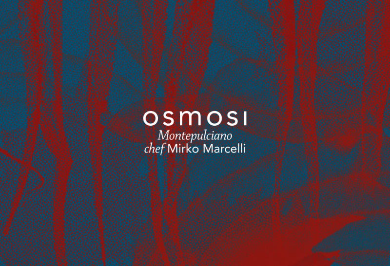
The overlapping of the elements on top of each other creates shapes that become almost unrecognisable if we do not look closely. In the graphics of the first season we find, for example, shiso, squid, a sheep and onions. All graphics are then treated with a dithering technique to optimise video and images on the web.

Responsive and upgradable
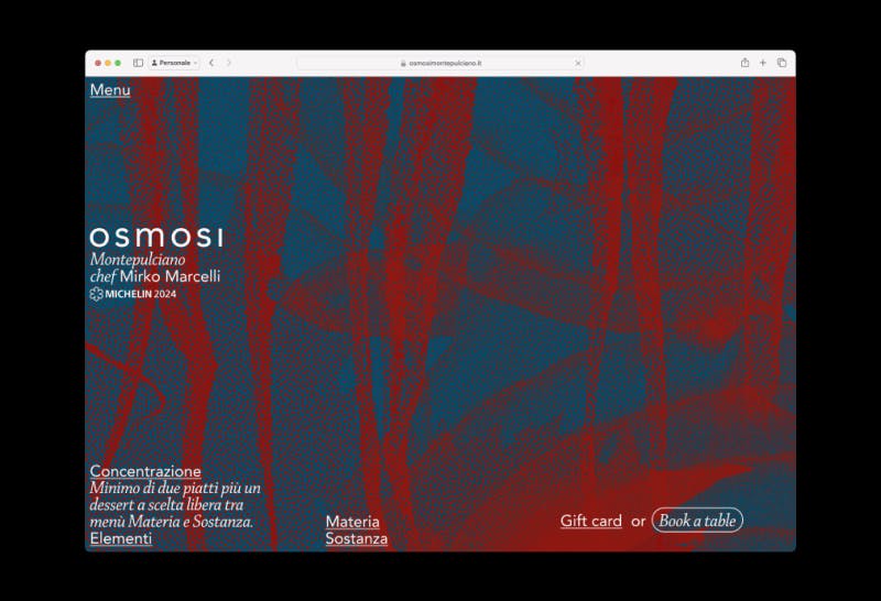
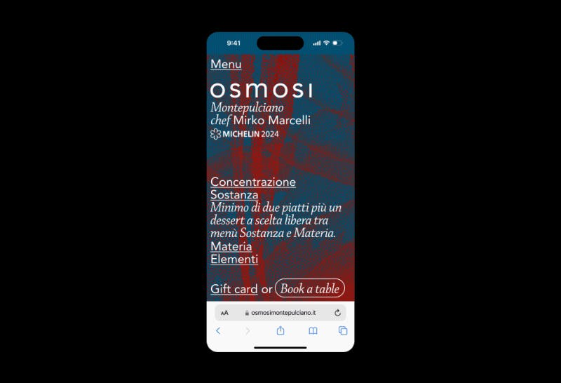
The structure of the site was inspired by the three-column menu contained in an A4 sheet, which is therefore created with three folds. The names of the four menus to be chosen are in the foreground and are reached via an accordion. Naturally, priority has been given to booking, which is in a dedicated column on the right and can be reached via the only buttons on the page. This season's version of the website can be viewed at osmosimontepulciano.it.

